Note: This post was updated on November 22nd, 2024 in order to fix some calculation errors.
Just how much of a strength is racial diversity for the United States? This question has spurred many scholarly debates, with brilliant thinkers from both sides proposing some excellent points. On one hand, some have argued that diversity brings crime, reduces trust, and is the source of endless conflict and resentment. On the other hand, others have pointed out that, hey, at least the food is pretty good. There have been a few individuals who have decided to delve further into this debate. In 2020, autodidact and HBD blogger Ryan Faulk of The Alternative Hypothesis produced an analysis titled “Fiscal Impact by Race in 2018”. As the name implies, he looks at the fiscal contributions/burdens created on aggregate by the four main racial groups in the United States: whites, blacks, Hispanics, and Asians. His results for the best estimate are presented below in billions of dollars:
Ryan’s work has provided a crucial foundation and is the source of inspiration for many others. For example, in 2021, another talented autodidact who goes by the name of “C. Kyle” has used Ryan’s methods to calculate the costs owed for the enslavement of African Americans over time in a video titled “Calculating Reparations”. The result? Not only were blacks as of 2021 not owed anything, but instead, they owed the country roughly $28.8 trillion.
I will therefore be continuing the work of these two brilliant gentlemen and be presenting the fiscal impact by race for the year 2022. Let’s get started.
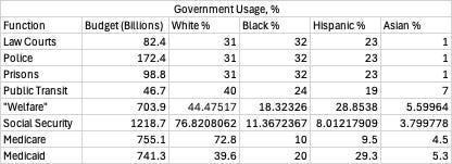
Firstly, costs. In Ryan’s analysis, he identified several government services which are likely to vary in usage between races in proportion to their population. I have decided to use the same services as he did, and these are the racial distributions for each of them. Note that not all of them might add up to 100% because of rounding error or because there were other racial categories in some of the sources I used.1
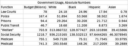
Then, I divided the costs of each service based on these racial distributions.
The rest of the services were assumed to be of equal government assignment, meaning that all races consume them equally on a per capita basis. So, adding together everything, we get the total amount of government usage by each racial group:
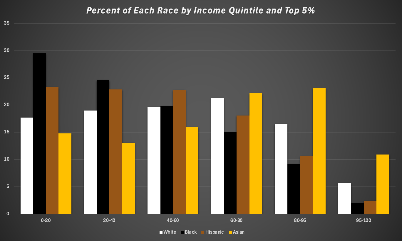
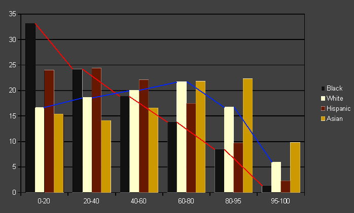
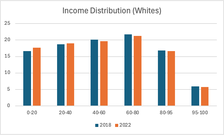
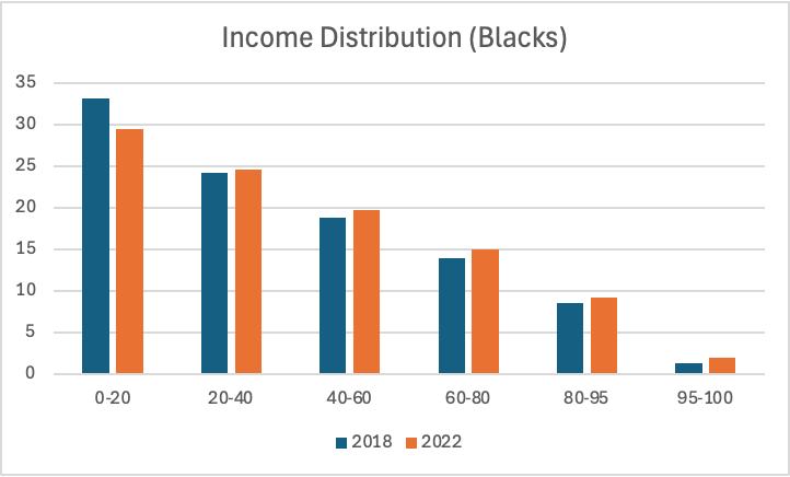
Moving on, tax revenue. Once again, we’re going to have to estimate it using various sources. Here’s the income distribution of each racial group:
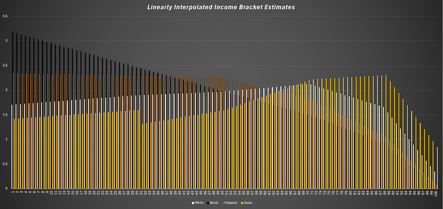
To get more accurate estimates, I will be interpolating the data just as Ryan did. This is to account for the differences in income distribution within each bracket.
We get the average contributions within each bracket, but we don’t see the effects at say the 1 percentile, the 86 percentile, et cetera. And so what a linear interpolation is just filling in the gaps between the known and unknown data:
Visual of the Gaps between Income Bracket Percentages
And so looking at that graph, it’s almost certain that whites within each bracket, for example, have higher incomes than the blacks within the same brackets. This is because the black trendline is down, and so, unless there is some radical deviation from linearity, this down trend will exist WITHIN each of these brackets, not just between them. And the income data presented above only takes into account number within each bracket, not their distribution within each bracket.
So, here were my results:
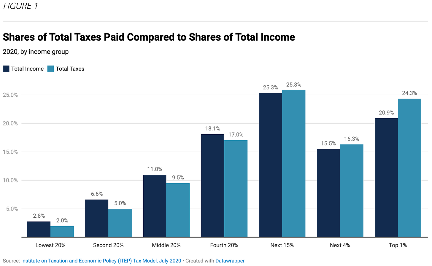
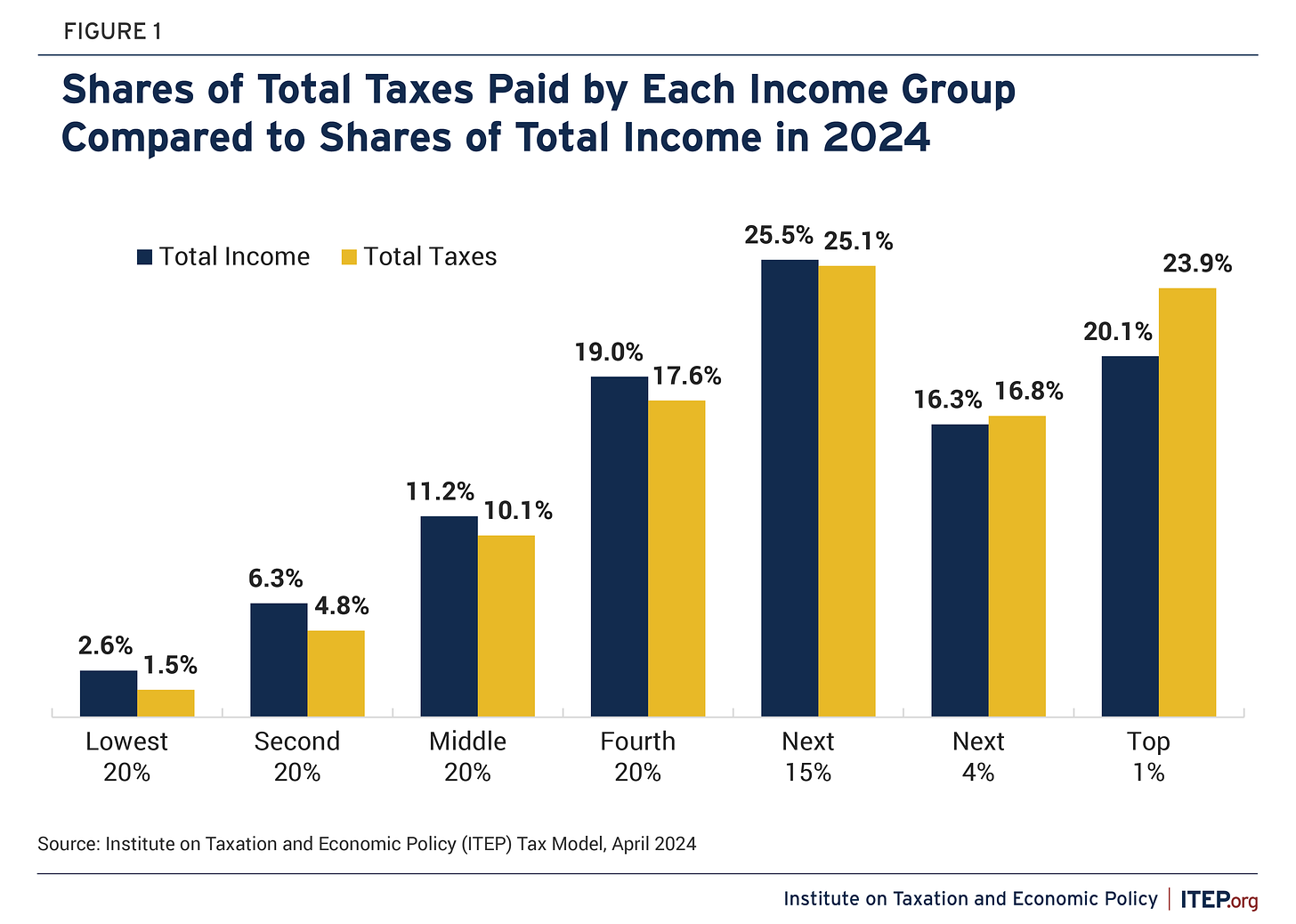
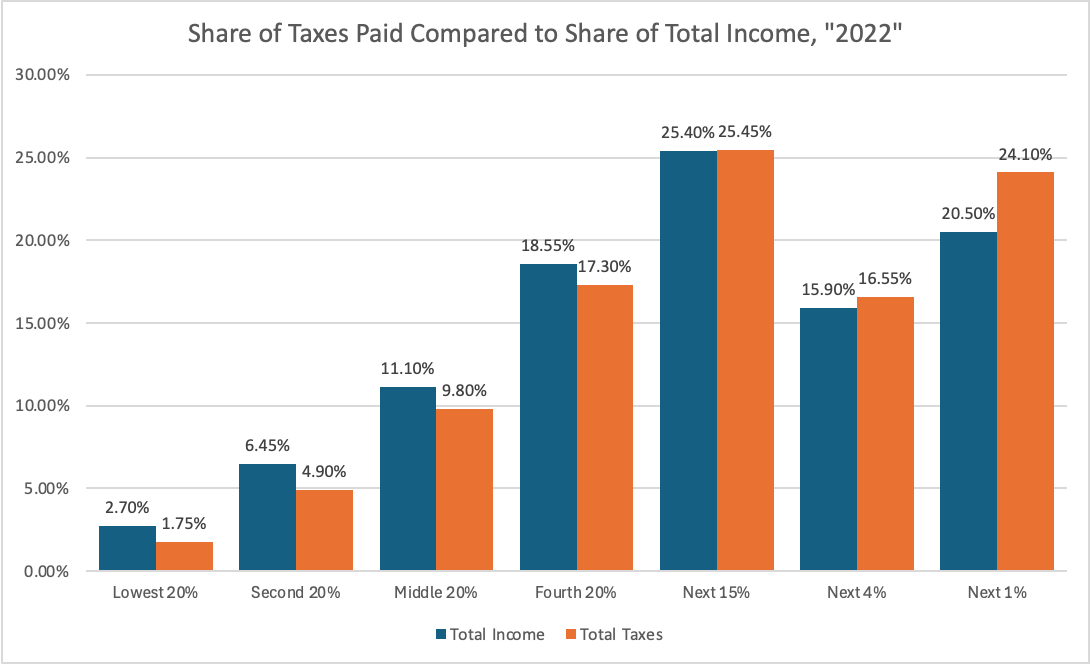
To estimate the amount of taxes paid, the Institute on Taxation and Economic Policy releases reports that calculate the percentage of tax revenue from each income bracket. Ryan got lucky because they had one for 2018, but there isn’t one for 2022. These are ones for 2020 and 2024, however:
Just eyeballing the numbers, they’re barely any different, but for absolutely no reason whatsoever, I just decided to average them out to produce the hypothetical values for 2022. It almost certainly doesn’t matter all that much considering none of the values even differ by at least 1%, so really there’s no point in doing so, but here it is nonetheless:
Great, now let’s calculating the total amount of taxes each racial group paid. Here is the full work for that:
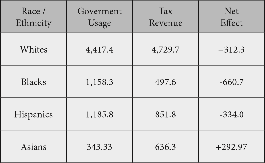
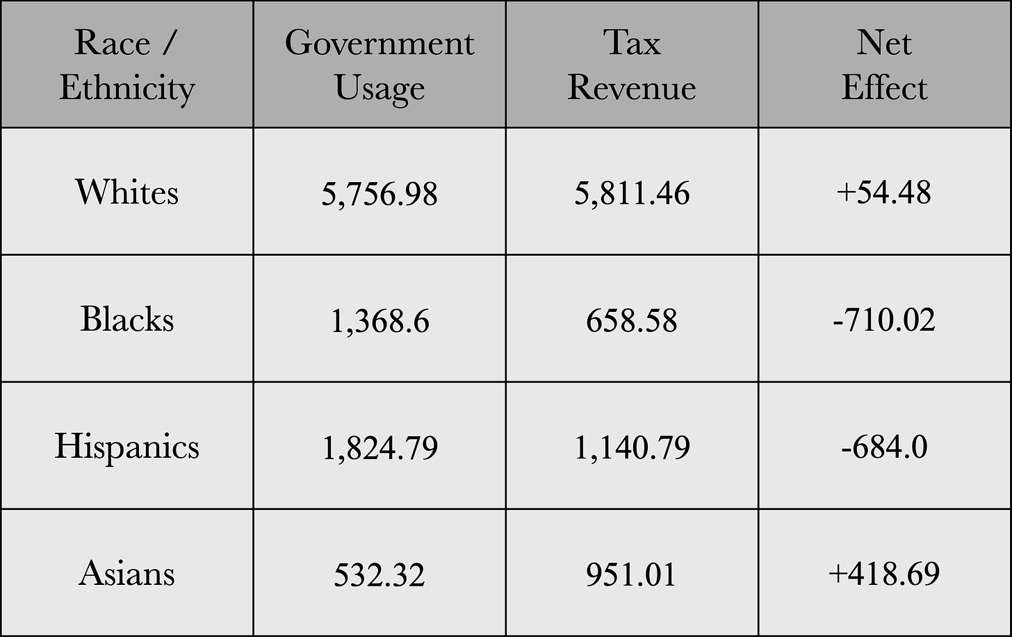
Now that we have both the government usage and tax revenue, we can estimate their direct fiscal impact for that year. So, lo and behold, the final results (yes, I liked Ryan’s table style so I copied it):
Okay, so immediately, we can tell that there has been some pretty major changes since 2018. Let’s adjust the net effect results from 2018 and 2022 based on the population size of each race in those years:
So, whites got worse, blacks actually stayed about the same, if not slightly worse, Hispanics got much worse, and Asians got tremendously better. Why? Well, since the net effect is simply calculated from subtracting government usage from tax revenue, let’s look at what has changed in both categories for the races. In terms of government consumption, the one program that whites disproportionately use whose cost has gone up immensely just so happens to be the most expensive one: Social Security. Hispanics had a sharp increase in welfare usage compared to 2018, which also became more costly. Asians have very low rates of government usage relative to everyone else, so they wind up looking good by comparison. So, that’s the government usage side of things. As for tax revenue, when compared to 2018, every race’s income distribution moved slightly upwards towards the higher end except for whites.
This change doesn’t appear to mean much visually speaking, but remember that those in the higher income quintiles pay a much larger share of all taxes. In other words, white Americans were the only racial group out of the four analyzed that got poorer. We can speculate as to why this might be the case in a bit, as in, how putting up with non-whites is hampering them. Before we do that, however, let’s talk a bit about the brilliant minds at Reddit. Back when Ryan made an earlier version of this analysis for 2014, it got quite a bit of attention in leftist communities. One enlightened Redditor said it’s deeply flawed for two reasons. The first reason:
The obvious flaws that most people should be able to pick up on are the fact that he falsely assumes that the races are distributed evenly within income brackets and he uses the single year of 2014 for his analysis.
How exactly is this even a point in your favor? If you had to assume what the distribution within each bracket looked like, it would be unfavorable to blacks and Hispanics relative to whites (which is what the interpolation is for) because their trend is downwards, so we can assume that within the same quintiles, they will be skewed towards the lower income ends relative to whites.
The second brilliant critique from this Redditor was:
The less obvious but fatal flaw is that this is a calculation comparing three groups that differ by almost 15 years in age. If you're at all familiar with the fact that net tax - transfers is not the same every year of your entire life you'll know that this makes the figures derived by Faulk essentially meaningless.
Okay, so it’s bad because it didn’t control for age. Well, let’s try to make an educated guess by taking a look at Census data for the age distributions of the races in 2022. Here’s my calculation of the percentage of youth and elders within each racial group:
So, whites and Asians are comparable when it comes to their percentage of youthful people, blacks are a bit higher, and Hispanics are substantially higher than everyone else. But when we look at elders, whites beat out everyone else. If you add up the percentages for youth and elder for each race to get a total percentage of the population that can be expected to be a net fiscal burden, they come out to around 42.42% for whites, 39.8% for blacks, 41.24% for Hispanics, and 35.83% for Asians. So, for whites, blacks, and Hispanics, the total percentage of their population which is a fiscal burden are quite similar, if not just slightly worse for whites. This argument is quite disingenuous even without looking at the actual data, just intuitively speaking. Economists have been saying for decades that the American economy is at risk of a slowdown and increased expenditures due to population aging. In fact, this has literally been the argument used to persuade white people into taking in millions of migrants from around the world, but, aside from the fact that it doesn’t actually work, when the numbers come out in a way that is favorable to whites, then suddenly population aging magically becomes an unfair advantage for them to have.
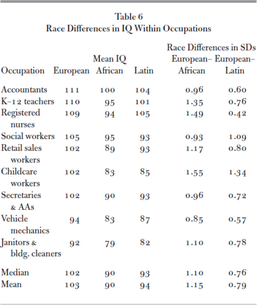
Now, it is true that this table is not telling us the full story on the costs of racial diversity. This is because there are also indirect costs that are not accounted for. Take, for example, property crime. You can take a guess who’s the most likely to commit those. Another one would be the lost productivity within various occupations from choosing to engage in diversity hiring over meritocratic hiring, and we know this absolutely is happening simply by looking at race differences in IQ within the same occupations:
Or, the cost of white flight. You could probably dig up several billion more dollars to add as the cost of having blacks and browns in your country. If we’re talking about immigrants, then not only do you have their direct costs and the costs associated with them from displacing natives from high-productivity areas, but also the cost of their children, who will have regressed toward the mean.
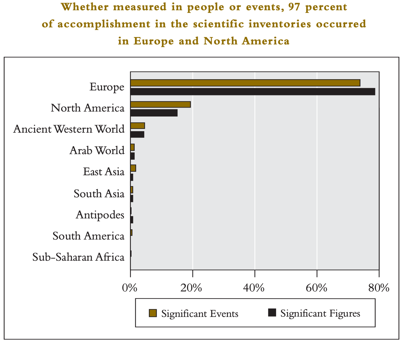
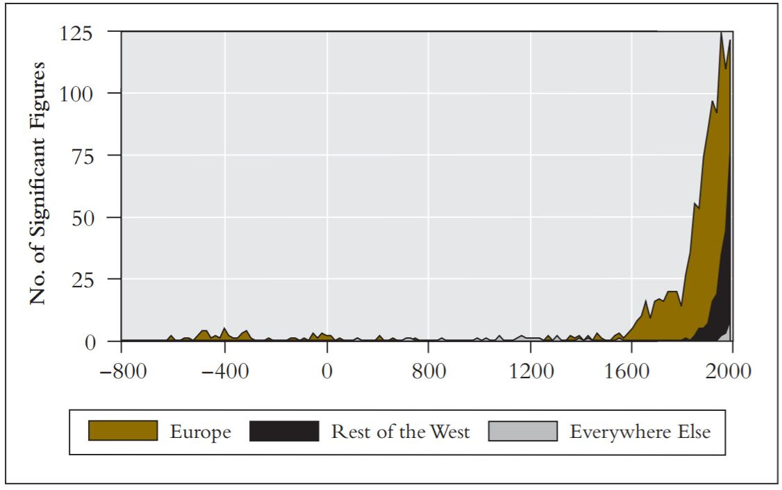
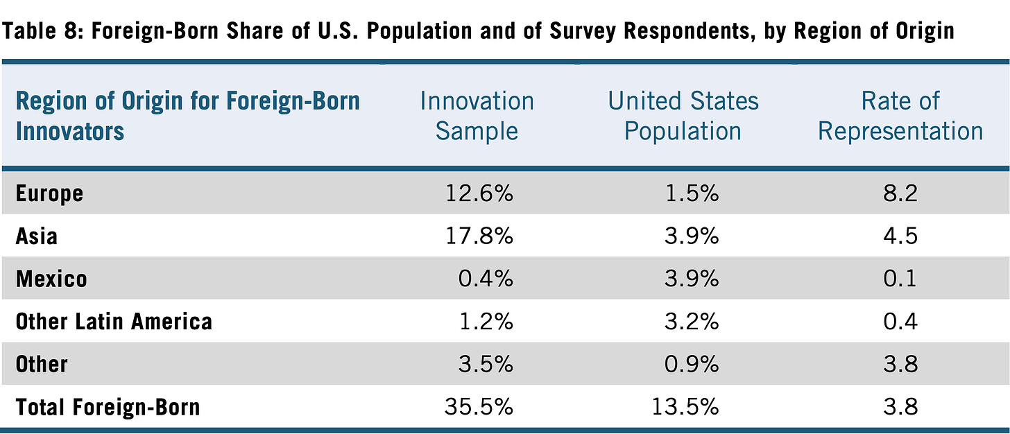
From these numbers alone, one might suspect that a good strategy would be to promote more immigration from Asia. After all, they’re a fiscal positive, even more so than whites, but, though it might be well-intentioned, such a policy is deeply misguided. For one, Asians are less innovative than whites both historically and in contemporary times.
Remember also that immigration is selective, and this is true for Asian immigrants as well. Immigrants from places like India are exceptional compared to their counterparts who remained on the mainland, and the more you let in, the more the immigrants coming in will resemble the average back home (Lazear, 2021). Moreover, we need to keep in mind that the Asian success here is in the context of the foundations that white Americans have created which enables them to easily access and climb their way to the top. Asians are entering into a country which is already well-established, with a strong economy where basic needs are readily met, allowing them to pursue high paying white collar jobs in the cities. A large share of the Asian fiscal contribution, therefore, can only exist because of whites. This is largely untrue the other way around because, as explained earlier, whites get crowded out by other groups and are discriminated against, thus hindering their ability to reach their full economic potential. Of course, if Asians were truly this overwhelmingly positive, their governments back home would all be running insane budget surpluses every year, but they’re not, not even among Northeast Asian countries which have higher National IQs than Western countries.
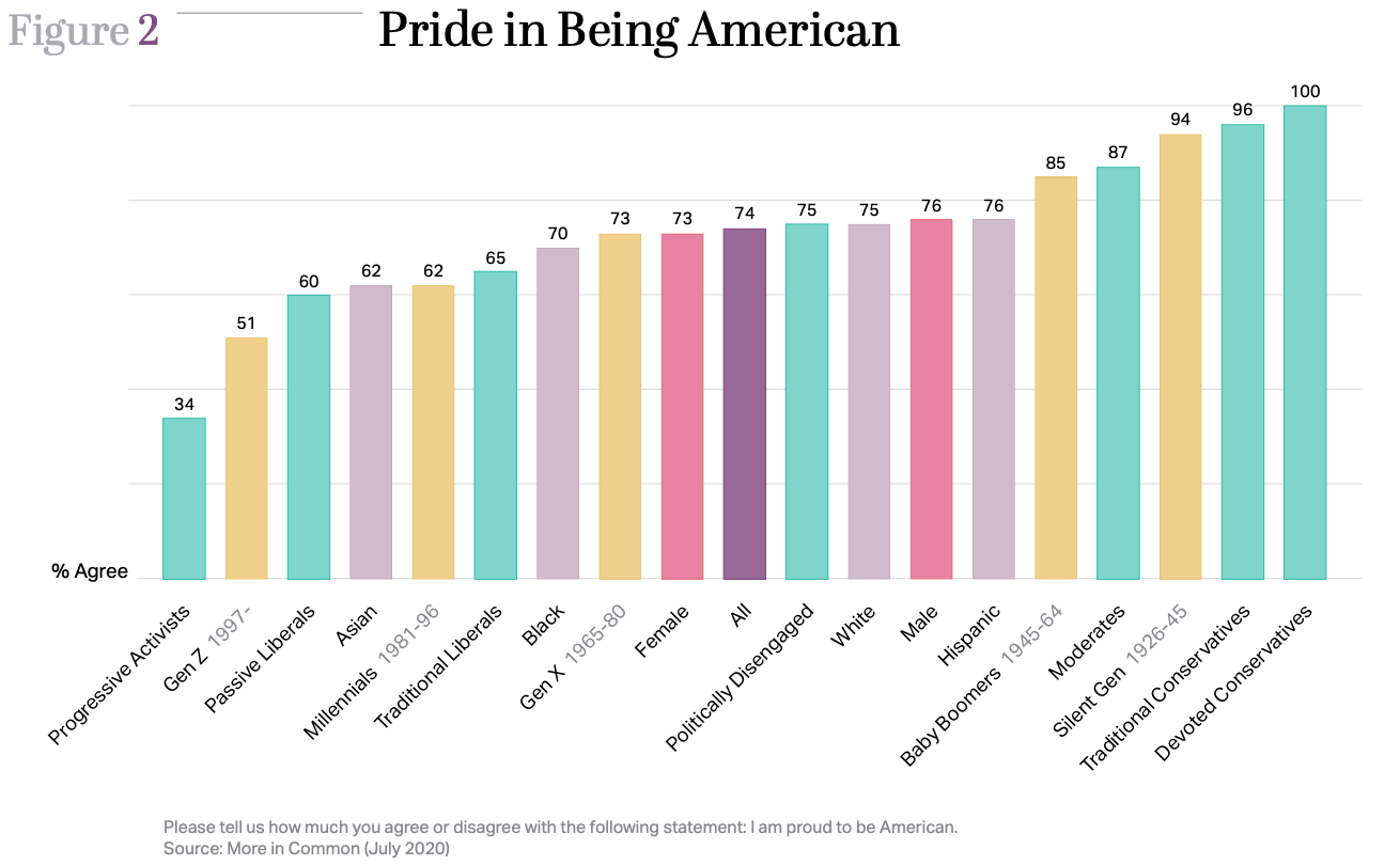
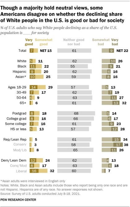
On top of this, Asians are also more leftist than whites.2 For instance, Asians are the racial group which is the least likely to feel pride in being American (Hawkins & Raghuram, 2020) and the most enthusiastic about the decline of the white majority in the United States (Krogstad et al., 2021).
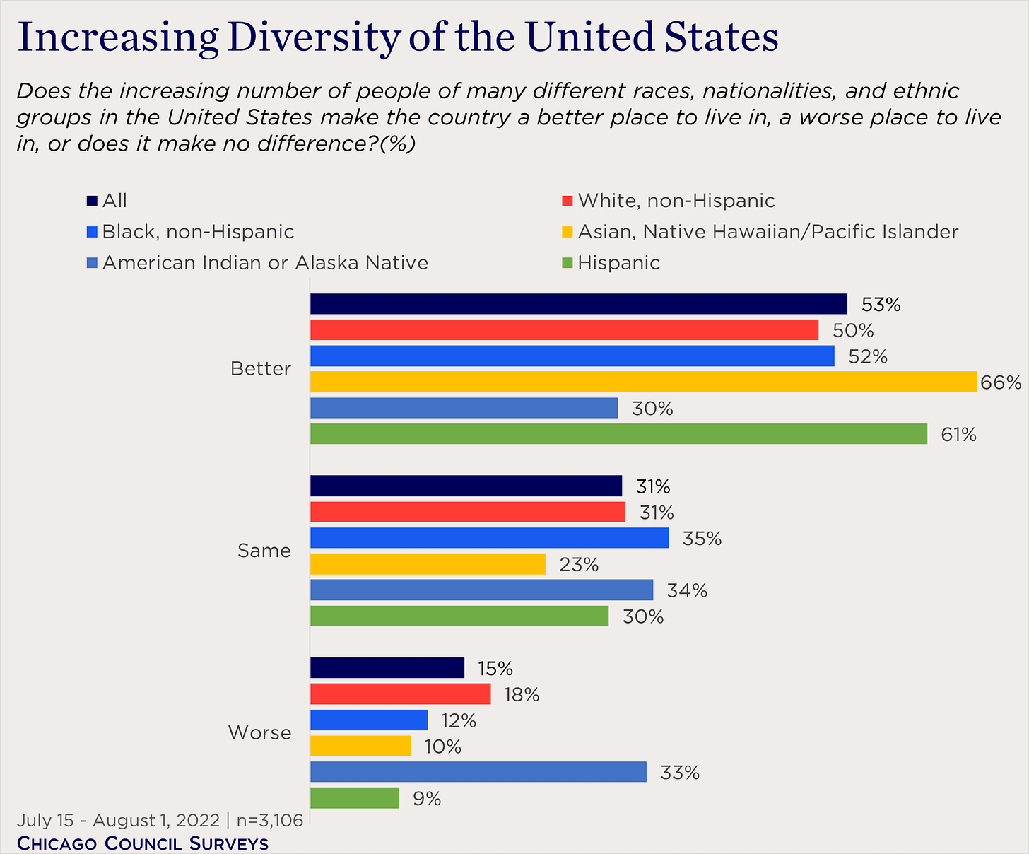
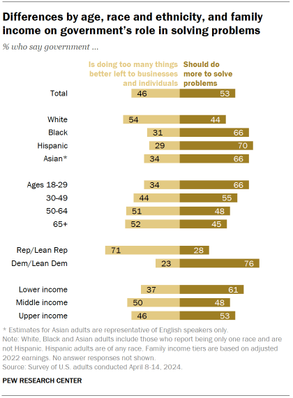
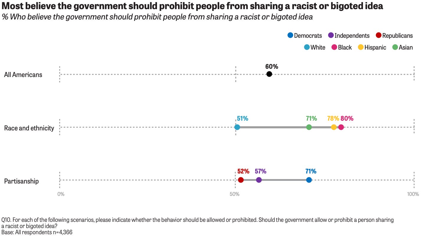
The activities of races don’t simply exist in a vacuum, everything they do affects each other, both the good and the bad. Something like supporting diversity is just a code for anti-white politics, supporting bigger government is essentially helping to flush money down the toilet, and supporting prohibiting so-called “hate speech” helps to reinforce the former two. Asians, being the great critical thinkers they are, are very keen on all three of these:
So no, even when it comes to Asians, it’s debatable if they are a strength to the country, and they will certainly become a burden if more of them are imported over in ever greater numbers, which is in fact what is currently happening, as they are the fastest growing racial group in the United States (Budiman & Ruiz, 2021).
Ultimately, the takeaway here is this: diversity is costly, quite literally, and expect it to cost even more in the future.
Sources Used for Calculations
U.S. government revenue in 2022: Government Revenue Details for 2022
U.S. government spending in 2022: Government Spending Details for 2022
Racial Distribution of Income Brackets: HINC-05. Percent Distribution of Households, by Selected Characteristics Within Income Quintile and Top 5 Percent
Tax Payment by Bracket: Who Pays Taxes in America in 2020 and Who Pays Taxes in America in 2024
Medicare Usage by Race: Distribution of Medicare Beneficiaries by Race/Ethnicity
Medicaid Usage by Race: Distribution of Medicaid/CHIP enrollees in the United States in 2022, by ethnicity
Social Security by Race in 2022: The World Almanac and Book of Facts 2024
Law Courts, Police, and Prisons Usage by Race: Prisoners in 2022 – Statistical Tables
“Welfare” Usage by Race: Understanding the U.S. Immigrant Experience: The 2023 KFF/LA Times Survey of Immigrants and Welfare Use by Immigrants and the U.S.-Born: Comparing program use by foreign- and U.S.-born-headed households
Public Transit Usage by Race: Who Rides Public Transportation
Racial Composition in the U.S.: Our Changing Population: United States
For some of these services, I did a bit of guessing. There was originally rounding error in the percentages for Social Security, so I tweaked the percentages a bit.
There was no data available on the race of public transit users in 2022. The latest report I could find was from 2017, so that’s what I used. Comparing it to reports from earlier years, it appears that the racial distribution hasn’t changed by much, so using it shouldn’t be that big of an issue.
The Center for Immigration Studies has a report on the welfare use of native and immigrant households for 2022. In Table 15 of their appendix, it presents the percentages by race and nativity. Using data on the percentage immigrant within each race, I was then able to get an overall estimate for each racial group that included both natives and immigrants. However, Medicaid was also included in the list of programs and I already had separate percentages for that. To solve this, I adjusted the estimates using the racial percentages for Medicaid proportionally based on its cost relative to the cost of all welfare.
Ruiz et al. (2023) presents the party identification of Asian Americans, with the overall being 62% Democrat and 34% Republican. An objection to using party identification is that it doesn’t measure liberalism/conservatism as well for non-whites as it does for whites. Fortunately, White & Laird (2022, Figure 0.6) provide the rate of identifying as Democrat based on liberal-conservative self-identification. For Asians, identifying as liberal tracks onto identifying as Democrat equally well for whites and Asians—81% for both. For conservatives, 19% of whites who identify as conservative identify as Democrat, whereas it’s just slightly higher for Asians—22%. This means that Asians who are conservative already do not identify as Democrat for the most part, so therefore the their strong affiliation with Democrats does accurately reflect their leftist attitudes.







Thank you for redoing this for 2022.
Do you have anything on the fiscal impact of immigrants? Some studies I've seen show a positive fiscal impact from them, especially from illegals